Why Good Design Matters
I have been trying to figure out when I first became interested in design. The earliest design memory I can recall is of my grandpa and I sitting hunched over his workshop table, glue and scissors in hand, carefully piecing together cutouts from old National Geographic magazines for a school project. I remember spending time fussing over the perfect alignment, shifting the images a fraction of an inch at a time, stepping back, and adjusting again. It had to feel just right. I didn't know it then, but I was learning something fundamental about design. Unbeknownst to us, we were using balance, contrast, and composition to turn scattered pieces of magazine into something whole that told a story. Perhaps that was the first time design I started to appreciate design for being more than just decoration. Or maybe our human brains are wired to find satisfaction in order, symmetry, and patterns.
Looking back, I can now see that design principles have weaved their way through many of my life experiences. As I have grown and matured, so too has my sense of design. It was present when I spent hours tweaking my first GeoCities page. I took great satisfaction in making design elements, like fonts and graphics, play nice with each other. It was present when I decided not to get a summer job in high school and instead build websites for a couple small businesses. It was through this experience that I learned about form versus function, and that my design preferences sometimes differed from my clients. Design appreciation is definitely not uniform, and what constitutes "good design" varies across individuals and cultures.
The more I reflect on it, the more I can see how my appreciation for design has changed overtime. The one common thread across all my experiences with design is that I have always been drawn to the feel of things. I have always appreciated how typography can set a tone, or how whitespace can create a sense of clarity. I've learned over time how even the smallest of design choices subtly shape the way we experience both the physical and digital world. I didn't have the words for it back then, but I could feel when a design didn't quite feel right. I thought constantly fiddling with layouts and colours was just my perfectionism taking over. I never saw design as a skill I needed to nurture and grow. It wasn't until much later that I realized how essential it would become to my work.
Challenging My Assumptions About Design
Throughout my career I've managed databases, analytics, and IT systems; functions rooted in logic, structure, and code. Design, I thought, was something you layered on top of the product, separate from how the product functioned. Most of my colleagues considered buidling out the back-end infrastructure as the most important part of the project. They just wanted to make sure whatever we were building worked. The aesthetics were for the designers to worry about later. This always felt counter-intuitive to me.
I made the mistake of seeing design as just one of my many hobbies. It wasn't a real skill that I had been developing over the years. I never thought of my time spent wrestling with typography choices, fussing about margins, and finetuning my data visualizations was anything more than appeasing my personal preferences. But as I progressed in my career, so did my understanding of design. Three things fundamentally changed the way I see design and how essential it was for the work I was doing.
Apple
In the early-to-mid 2000's I became fascinated by Apple. Their products looked great, but it was the way that Steve Jobs spoke about them that drew me in. I remember being glued to his keynotes. I had never seen a company place so much importance on user-centric design. They seemed almost obsessive about it. At the time, they seemed to know what we wanted before we knew we wanted it. Apple fussed over the smallest details and had an uncanny ability to find harmony between form and function. They didn't just design high performing tech, they designed experiences. There was a clear focu on how a product felt in the hands of a user.
Apple's approach to design was different than other tech companies. Design wasn't an afterthought, nor was it about simply making something look nice. It was about making a product that was intuitive, seamless, and even emotional. Jobs famously said, "Design is not just what it looks like and feels like. Design is how it works."
This was my first "aha!" moment.
The Design of Everyday Things
The Design of Everyday Things, written by Don Norman, exposed me to a simple truth: virtually everything is designed. When something is poorly designed you feel it, even if you don't realize what's wrong. Norman breaks down why some objects, interfaces, and systems are intuitive while others are frustrating. He explains concepts like affordances (indicators that tell you how something should be used) and signifiers (small details that guide behaviour).
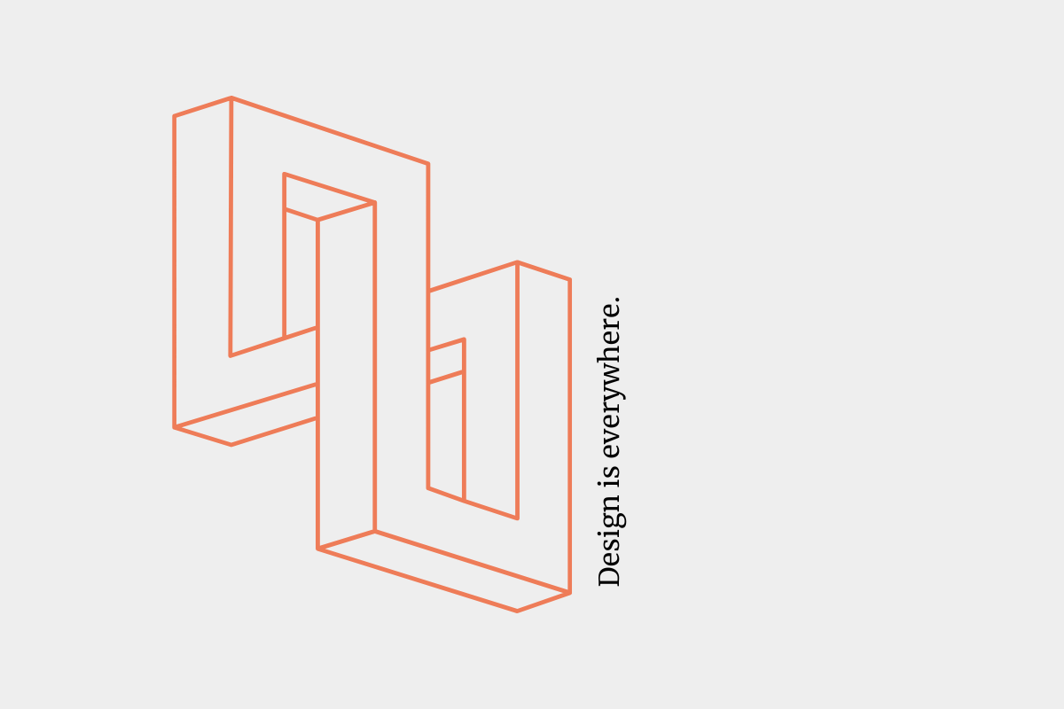
Design is everywhere, and after I read this book I realized that many things are not designed very well. From poorly designed door knobs, to convoluted onboarding workflows, to clunky user interfaces. Poor design can make simple tasks seem impossible. Norman says, "Good design is actually a lot harder to notice than poor design, in part because good designs fit our needs so well that the design is invisible, serving us without drawing attention to itself. Bad design, on the other hand, screams out its inadequacies, making itself very noticeable."
This was my second "aha!" moment.
The Winnipeg Jets App
The biggest shift happened when I was working on building the new official Winnipeg Jets app. At the time, most teams were choosing out-of-the-box solutions. One thing we didn't like was that most of these vendor solutions leaned on web views, which we felt was a suboptimal user experience. We chose to build the app natively from the ground up, allowing us to fully tailor the experience to fan preferences while seamlessly integrating with our back-end systems for a smoother, more intuitive user experience.
We partnered with Mirego to bring the app to life. What struck me most was their commitment to the discovery part of the project. Before a single line of code was written, we set out to speak with thousands of fans through surveys, fan interviews, and observing how people used their phones while watching hockey games. It felt like we spent more time truly understanding how fans connected with the team and how they envisioned using the app than we did actually building it. Every decision we made we asked ourselves, "How does this impact the fan experience?"
The project employed fan-centric design as it's guiding principle, and it paid off. We received multiple nominations and awards for best user experience, visual design, and sports app functionality. It was recognition that we had built something that was going to truly resonate with our fans. The experience reinforced the lessons learned from Apple and Don Norman. Great design is not just how something looks, but how it works, flows, and makes you feel.
Bringing It All Together
The practice of good design is not a nice-to-have luxury. Design is essential, and it's not just about making things look beautiful; it's about making them functional, intuitive, and evoking emotion. Good design turns a clunky app into an effortless experience. It's what makes complex reporting dashboards actually usable. It's what separates technology that works from technology that feels good to use.
I've stopped seeing design as just a hobby, and now see it as a core skill that needs to be nurtured. In my field, design is essential to making technology work for people. You can invest in the most advanced systems, but without user-centric design, even the best technology will feel slow, inefficient, and frustrating to use.
The question I now ask myself is: Is this a technology problem? Or is it a design problem? What I have found is that more often than not, it's the latter.